Shaun Maclennan
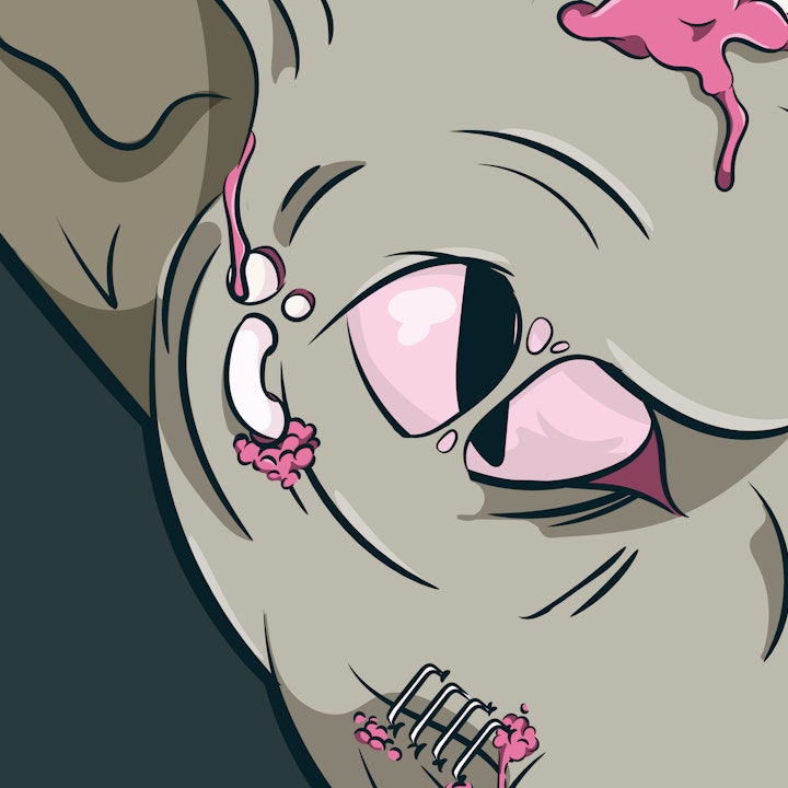
Laser Eye Surgery
Illustration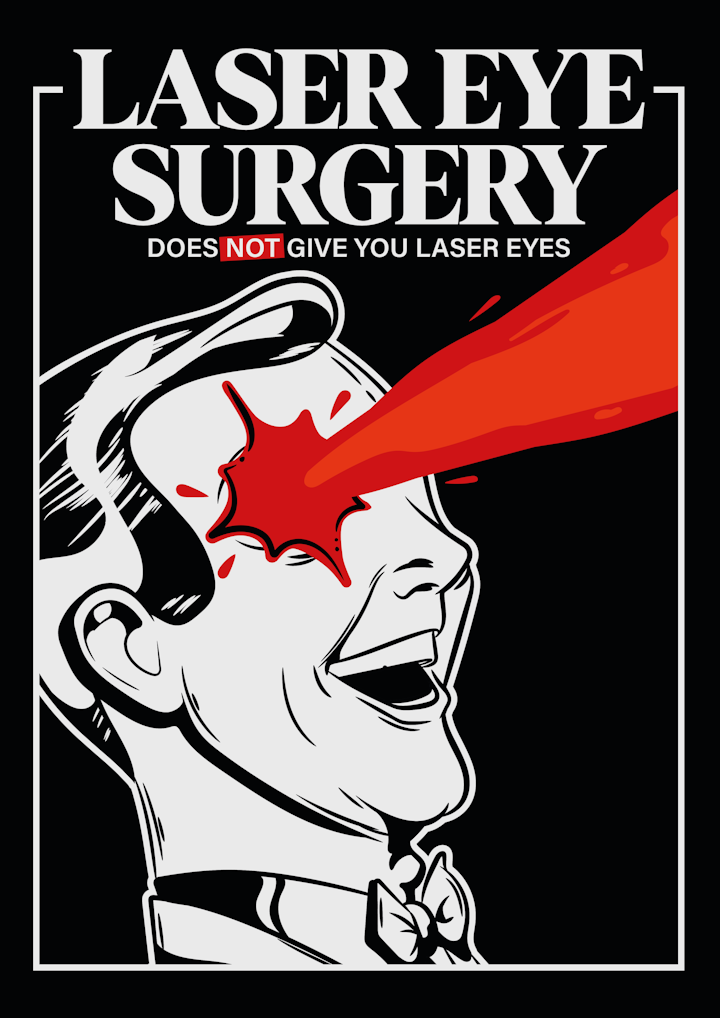
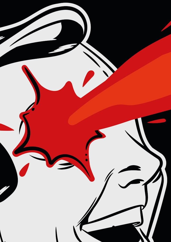
Laser Eye Surgery
Illustration
I was invited by Peregrin Studios to test out one of their recent fonts in their foundry, Denton.
Inspired by the bold, tightly set headline serif titles from the 70s Denton is designed to meet all the needs of today's brands.
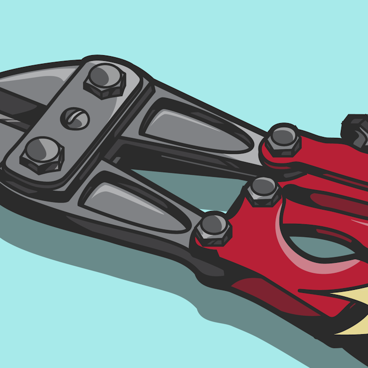
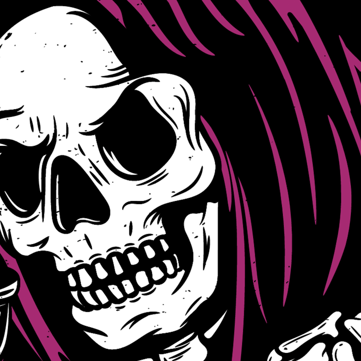
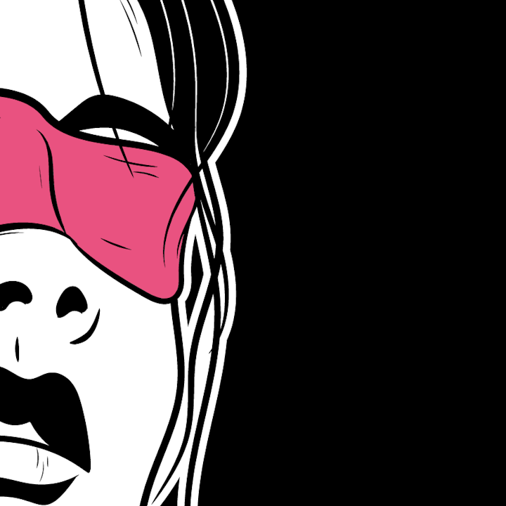
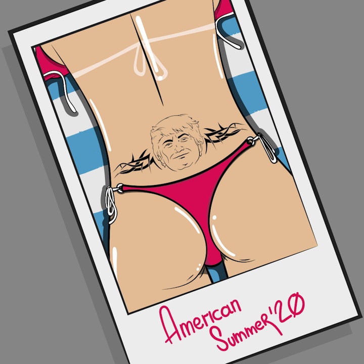
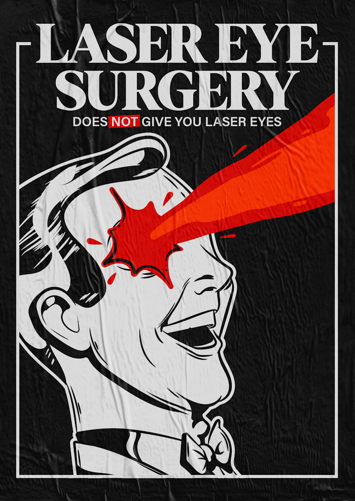
When it comes to 70s illustrations I am instantly reminded of those classic safety posters. The kind you can't help but read in the cliche nasally British narrator's voice. "Be bright! Wear your hard hat." or "Turning right? Get in the correct lane." The headlines give a very clear almost sarcastic takeaway to the reader. Below is one of my own renditions of these posters
